When you design a website in Taiwan, there are basically 2 things you have to be aware of:
1. Taiwanese people love using mobile phones
2. Traditional Chinese fonts are very limited
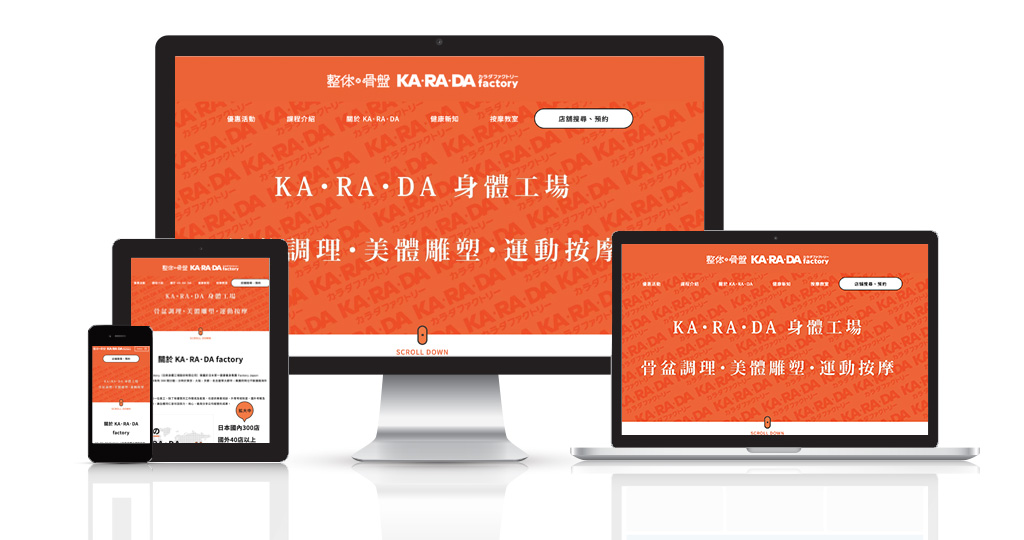
We recently had an opportunity to plan and design a website for KARADA factory, a Japanese massage/chiropractic clinic in Taiwan. In this blog, I would like to share our process of how we designed the website step by step.
Contents
Step # 1 Analyze

In this era, there are no companies who do not have a website.
Every company has one.
So why do companies want to design a website again?
It’s because they think their websites are outdated.
How do they know their websites are outdated?
It’s the design.
Well, we do try to renew design but at the same time we want to design a website that works so we begin our renewal by analyzing the previous website and define the bottleneck.
KARADA factory was no exception.
Let me share what we found out after analyzing KARADA’s website.
1. People make a reservation via phone call
2. People view the price page a lot
3. There is a correlation between engagement and CVR (higher the engagement, higher the CVR)
4. Women are the majority users
5. 80% mobile access
and many more
So we made a couple of hypothesis:
1. If we made the phone call reservation easier to access and click, wouldn’t the CVR rise?
2. Isn’t it better UX if the price was written in each service page?
3. Will it convert better if users could see other related services and other pages because it will increase engagement?
To sum up, we decided to design a website with clear reservation button on top as header and intent to make users see more than 1 page in each session.
We also knew that there will be more women users so we thought about how women would interact with the new website.

most importantly, the purpose of renewing the website was to improve the CVR so we constantly thought about how we can improve the CVR
Step #2 Design system and elements

After analyzing and clarifying objective for the new website we then went to define basic elements of the website such as color, typeface, space and size.
For the font, we chose Noto Sans CJK.
KARADA factory is a Japanese company so we thought one day the company may ask us to build a Japanese version.
If we chose a Chinese font that was not compatible with Japanese font, the style of website may be affected so that is why we chose Noto Sans.
Also, we noticed that their Japanese website was also using Noto Sans.

For the color of font, we chose relatively dark black #1a1a1a.
We often use rather grayish color in order to avoid high contrast between the font and background but since KARADA’s corporate color was orange, we thought gray font will not stand out enough.

We also wanted to convey a sense of trust so we thought black was more suitable than grayish black.
Step #3 Design
After we made the wireframe for the website, we went on to start designing.
Like I mentioned, we cared a lot about “mobile-friendliness”.
While many website design companies start designing from desktop ver. of design, we started from mobile.
So what is “mobile-friendly” website?
We thought bold letter, use of icons, and mobile customization were the keys.
bold letter, use of icons, and mobile customization
We took a video on how people interact with website on mobile phone before and noticed that people scroll down faster than we think.
Therefore a website stuffed with texts is usually not read.
We also noticed that when there is an icon or image between contents, people stop scrolling.
Therefore, we decided to use many icons for emphasis and bold letter so that people stop scrolling down and spend time digest contents.
In other words, we wanted to make a website that is read by users.


Step # 4 Check, Check and Check
After finishing the design, we then started coding.
When we start coding, that is when we start checking the website appearance over and over.
Why so many check?
Take a look at the image below:

This image describes variety of resolutions of incoming users’ mobile devices.
a website that looks normal on iphone 11 may look odd on Samsung or other mobile devices.
It is impossible to check how a website looks on every device but we check with iphone8, iphone10, iphon11, and Galaxy.
All of our staff members carry iphone so we bought Galaxy just for a website check.
The result?
So what happened to the CVR after renewal?
We renewed the website in August, 2019 and it may be too early to say it is better but the performance has risen.
In fact, the company feels troubled because they now have to decline many reservations.
They are now enhancing recruitment.
We also heard a good news that because we made a facial course page and KARADA yoga page which were previously not available, the reservation from facial course and yoga increased.
Things to watch out for when making a website in Taiwan
Let me reiterate some of the points that I think it’s important to know when designing a website in Taiwan.
1. mobile-first: I think this not only applies to the users of Taiwan but the entire world. People are browsing internet with their mobile phones more than ever. A mobile-friendly website is key to conversion.
2. Ask how your design company thinks about mobile: If you are going to outsource your website design, make sure the design company cares about mobile-friendliness.
If you want to know more about how we design a website in Taiwan or see what we have done with designing a website, let us know!
Click to contact applemint.


